Product Audit & Optimization
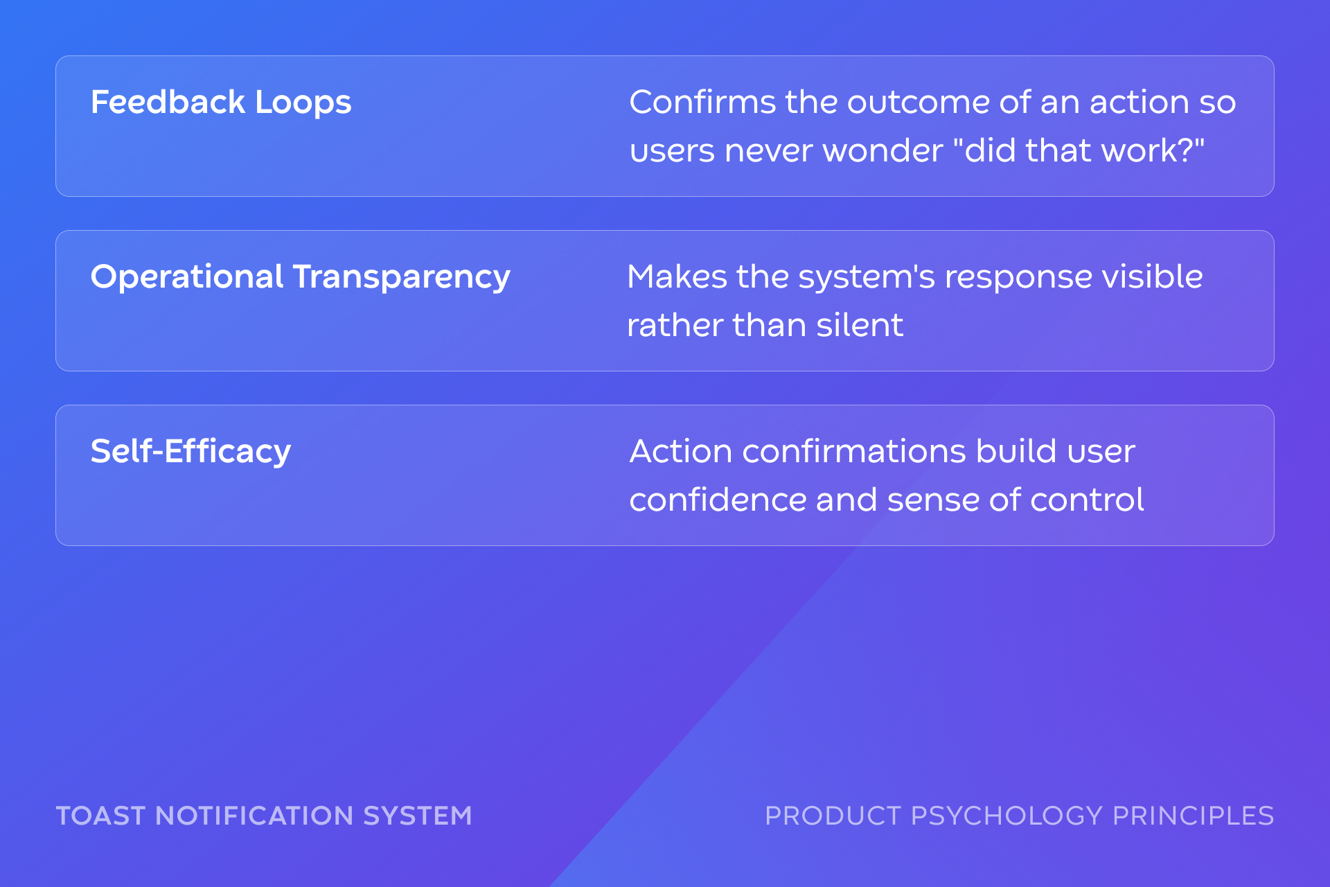
While taking a Product Psychology course, I started documenting my own experience with the Runwise app, cataloging friction points, brand inconsistencies, and missed opportunities through the lens of principles like Labor Illusion, Loss Aversion, and Feedback Loops.
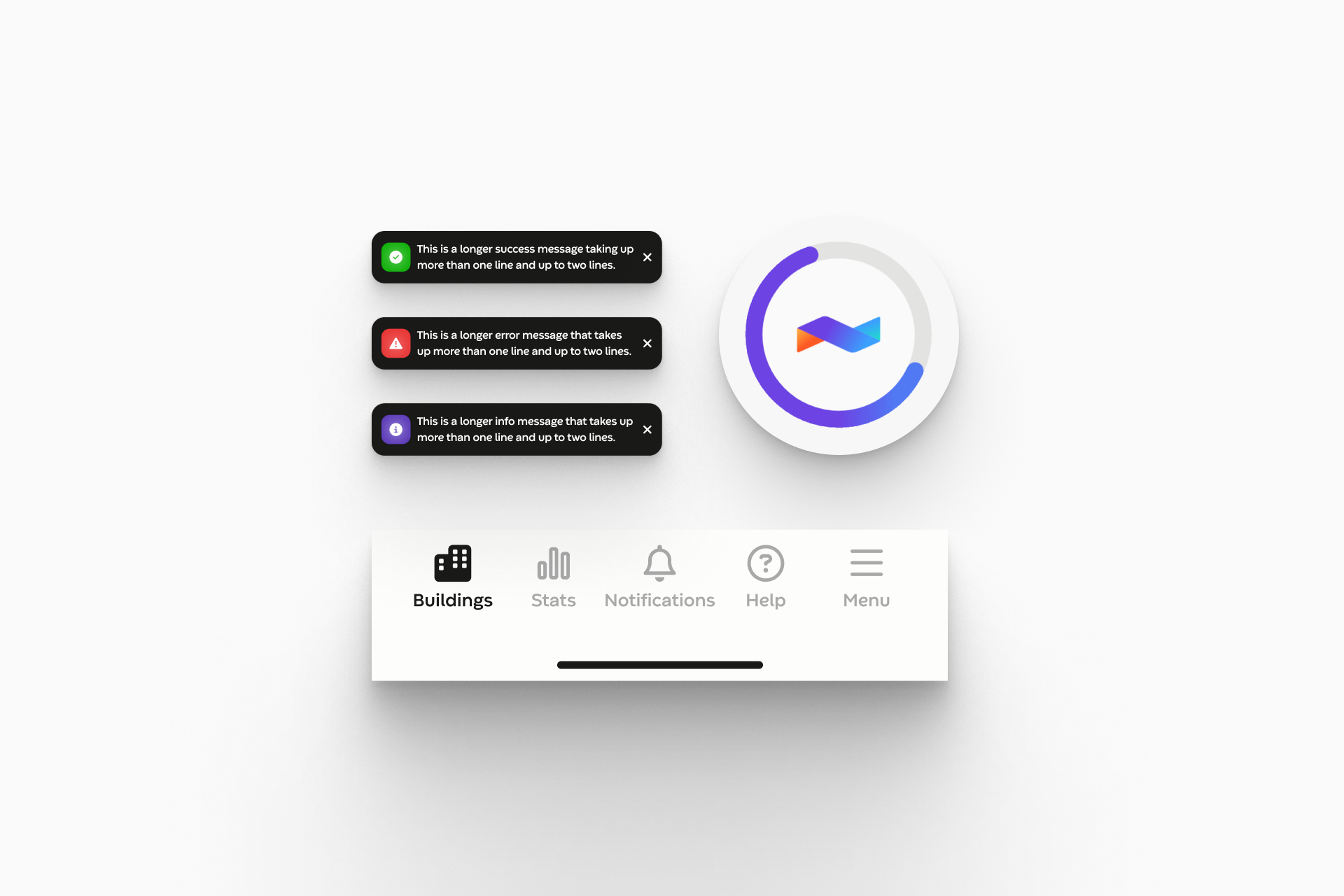
This work led to shipped improvements including a redesigned notification system, branded loading states, and navigation micro-interactions.
Role
Lead Product Designer
Contribution
Product audit & heuristic evaluation, Micro-interaction design, Animation production & dev handoff, Cross-functional collaboration with engineering, Product psychology application
Toast Notification System
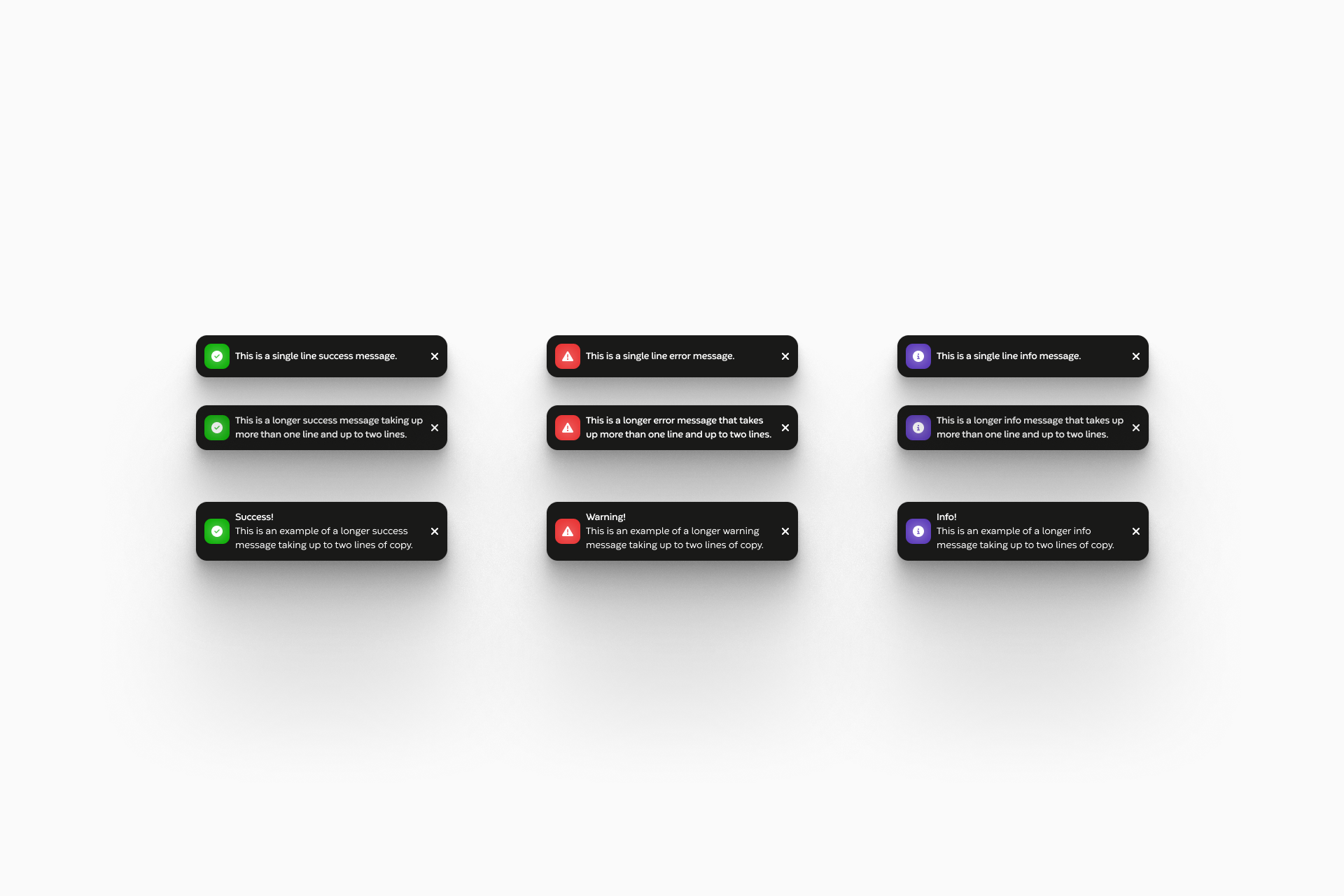
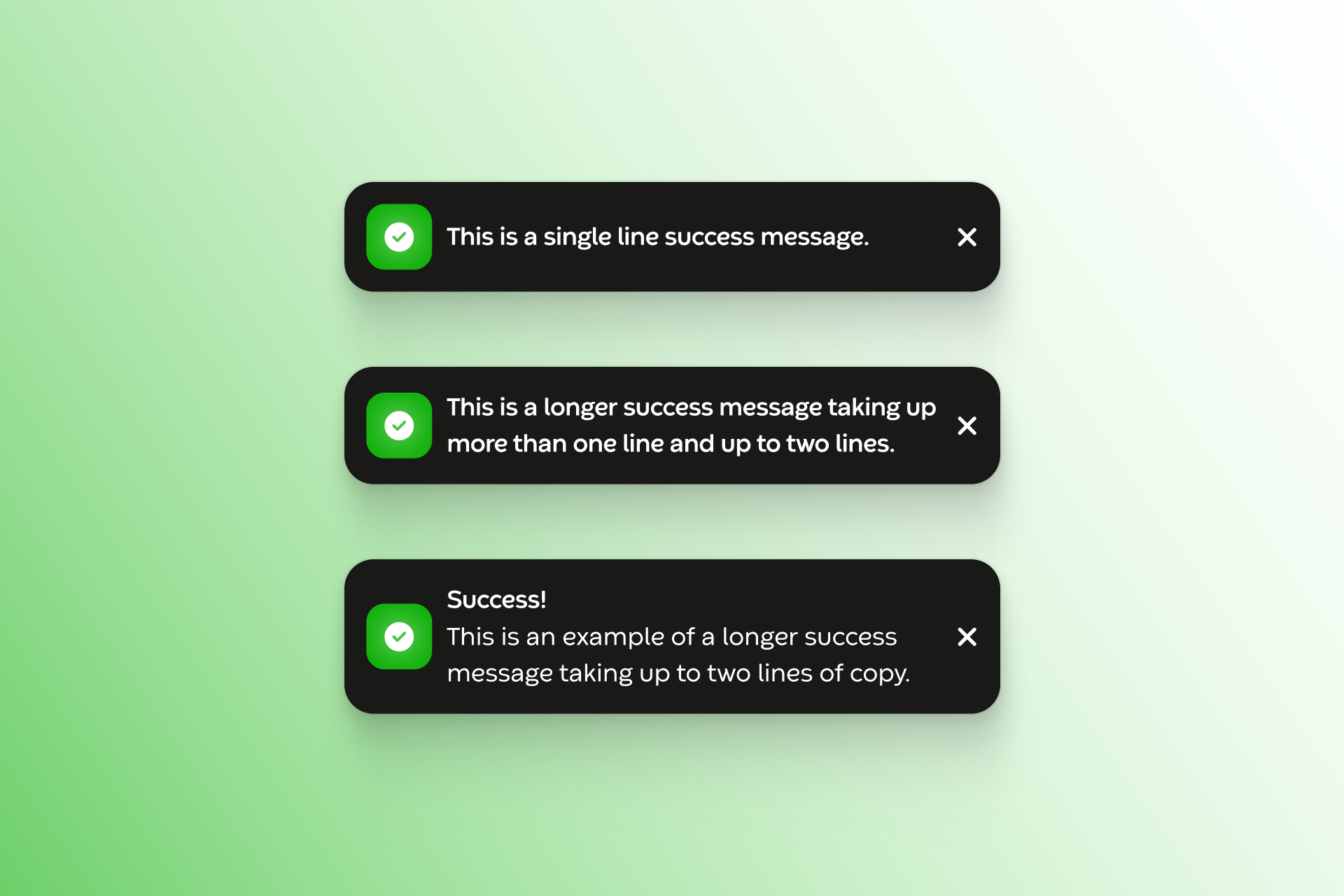
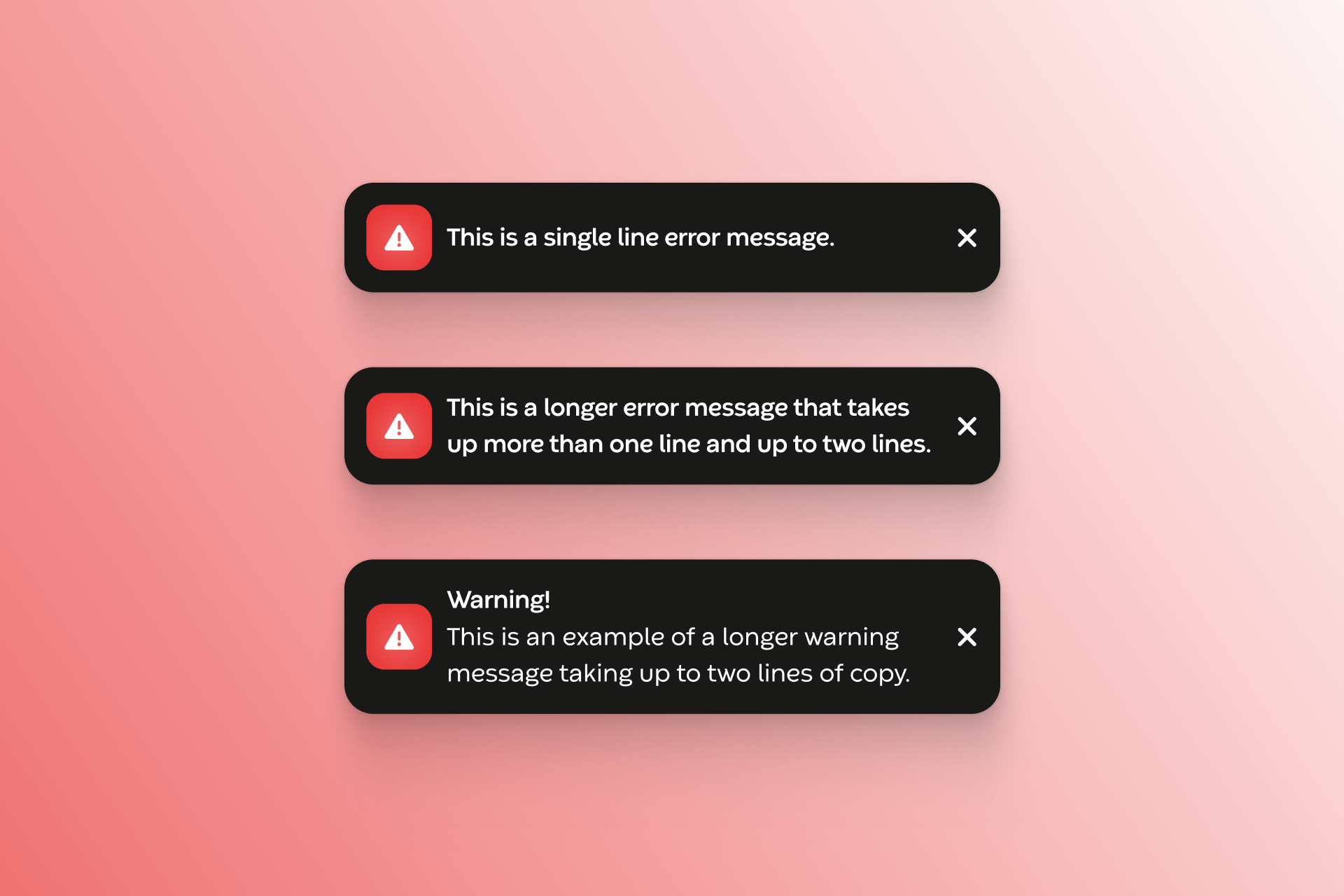
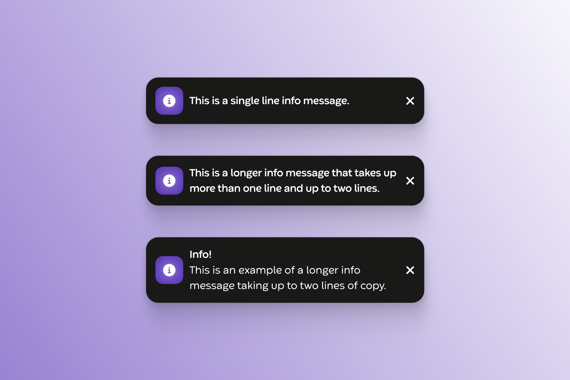
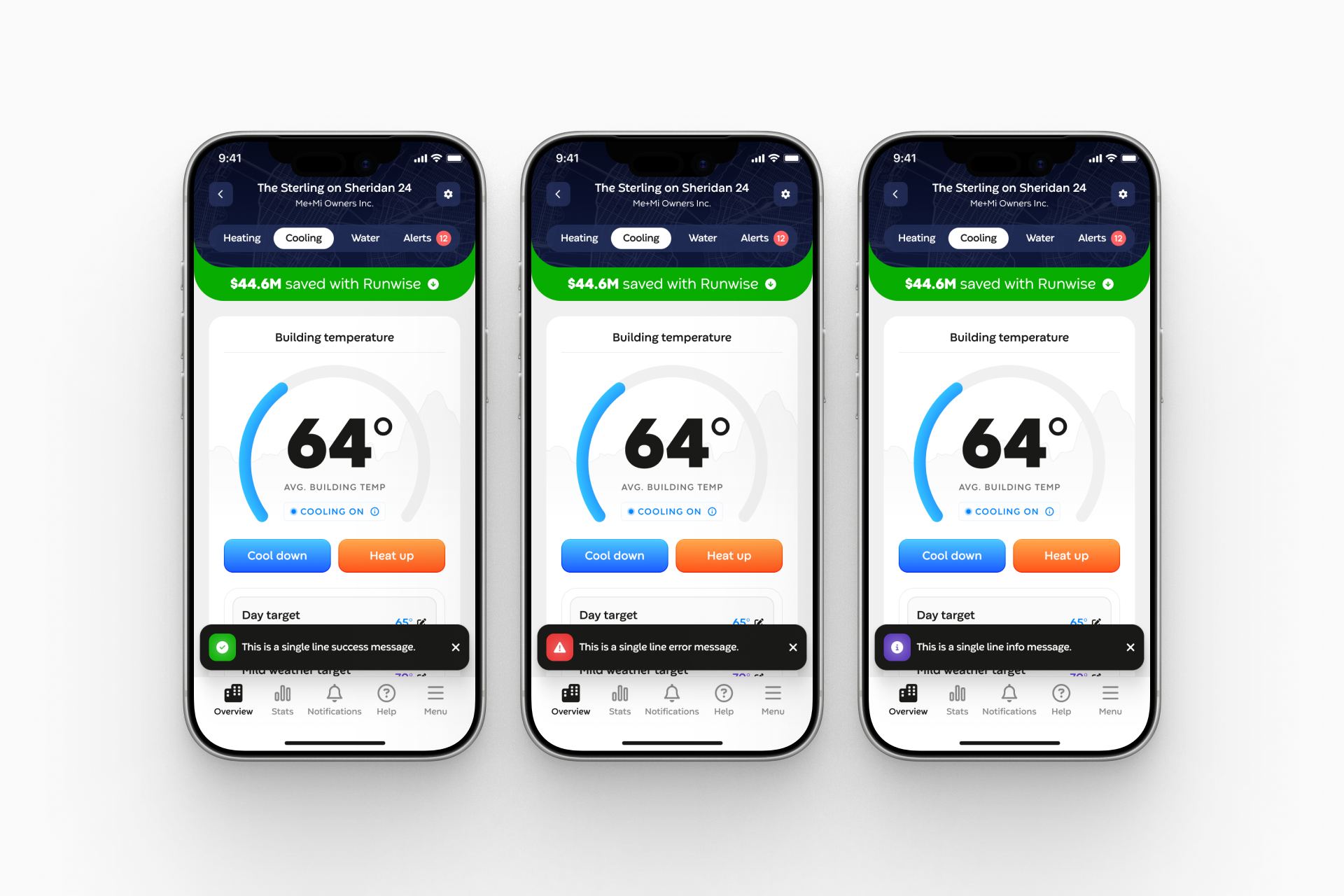
The previous toasts were off-brand with inconsistent spacing, typography, and color that undermined the brand and product's credibility. I redesigned the notification system to align with our brand standards and provide clear, real-time feedback on user actions, keeping users informed without interrupting their flow.
Navigation Micro-Interactions
The bottom navigation had no transitions — just abrupt, instant state changes that made the app feel rigid. I introduced subtle state transitions including a ripple on tap, line-to-filled icon shifts, and a soft pulse animation that create a more tactile, polished feel without drawing attention to themselves.
Loading Animation
The original loading experience was a generic gray spinner that made the app feel broken or unresponsive. I designed and tested multiple branded logo animation variations, collaborating with engineering to implement each version in-app and identify the strongest performer. The final animation makes system processing feel intentional and reduces perceived wait time.

