Brand Ecosystem
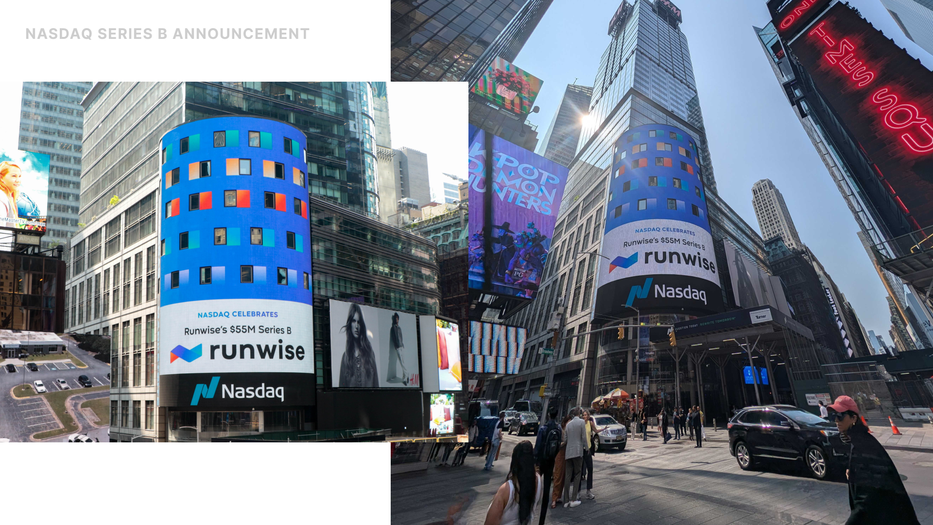
Runwise had grown into a mission-critical smart building platform managing 10,000+ buildings but its brand hadn't kept up. I led a multi-phase brand evolution aligning the brand with the strength of the product and long-term vision, establishing an entire brand ecosystem: logo system, design principles, brand book, and a visual language that scales from business cards to a NASDAQ tower display. It gave the company a cohesive identity for the first time.
Role
Lead Product & Brand Designer
Contribution
Brand strategy, Visual identity design, Product-brand integration, Design system development, Creative direction, Experience design, Stakeholder collaboration

The Challenge
A strong product held back by its brand
Runwise had grown into a mission-critical platform, but its brand hadn’t kept pace. The identity underrepresented the product’s strength, leaning technical over benefit-driven and creating a gap between reality and perception. At the same time, the original logo and gradient system failed at scale. Reproduction issues across product, marketing, and print reduced clarity and consistency.
This wasn’t cosmetic; it was structural. The brand needed a scalable system that matched the strength of the platform.
The Strategy
Align before redesign
Before touching visuals, I led a three-week brand workshop series with 21 team members across product, engineering, sales, marketing, and operations.
The goal was clarity: define how Runwise is truly experienced, separate core from noise, and translate lived reality into brand foundations.
Through persona metaphors, personality spectrums, and perception exercises, the work shifted from a visual refresh to a shared definition of who Runwise is and who it’s becoming.

The Solution
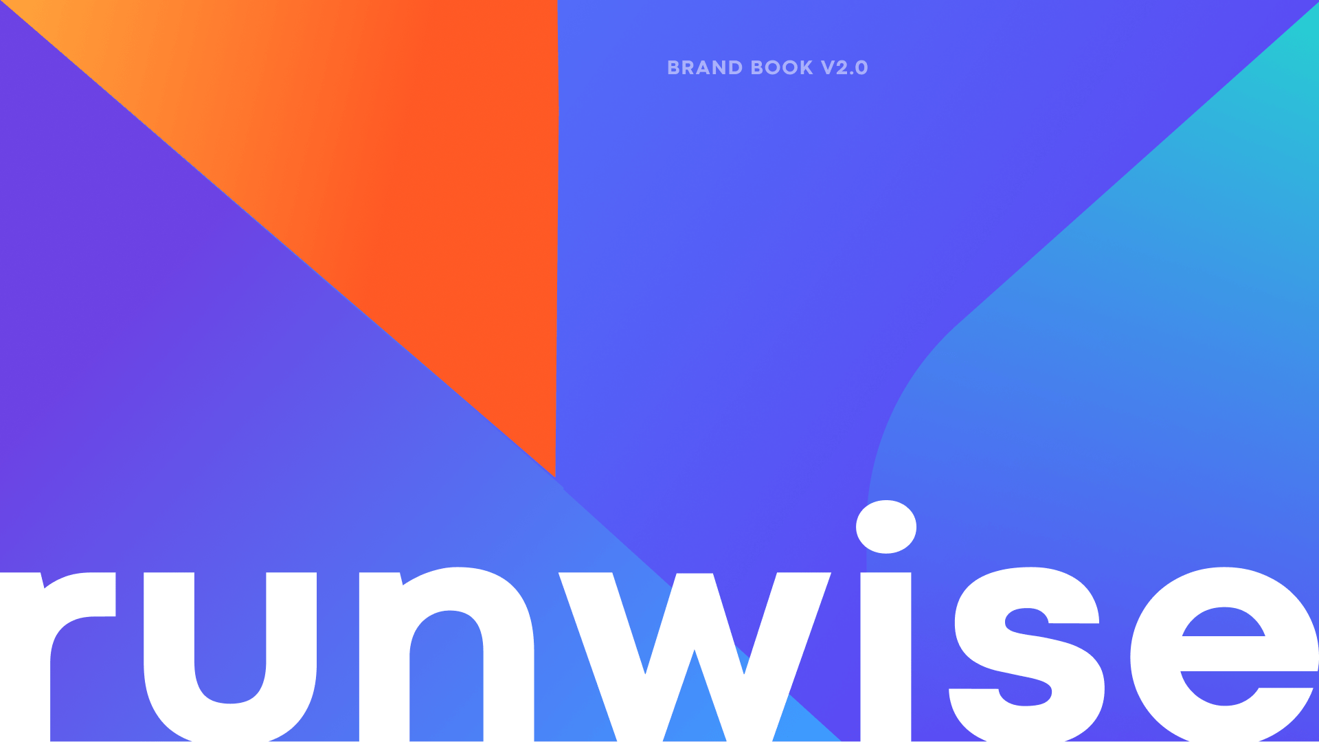
From visual identity to scalable system
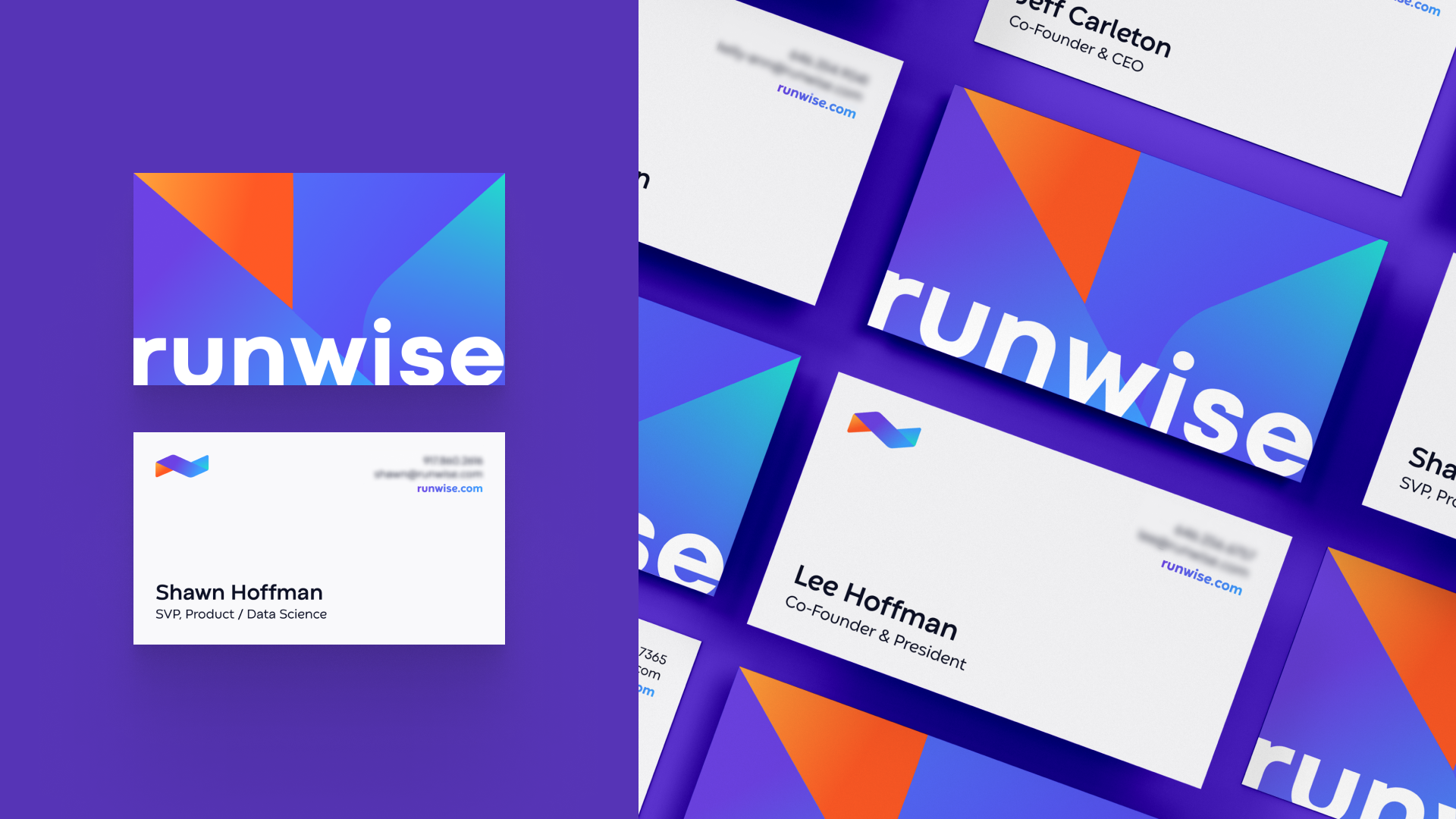
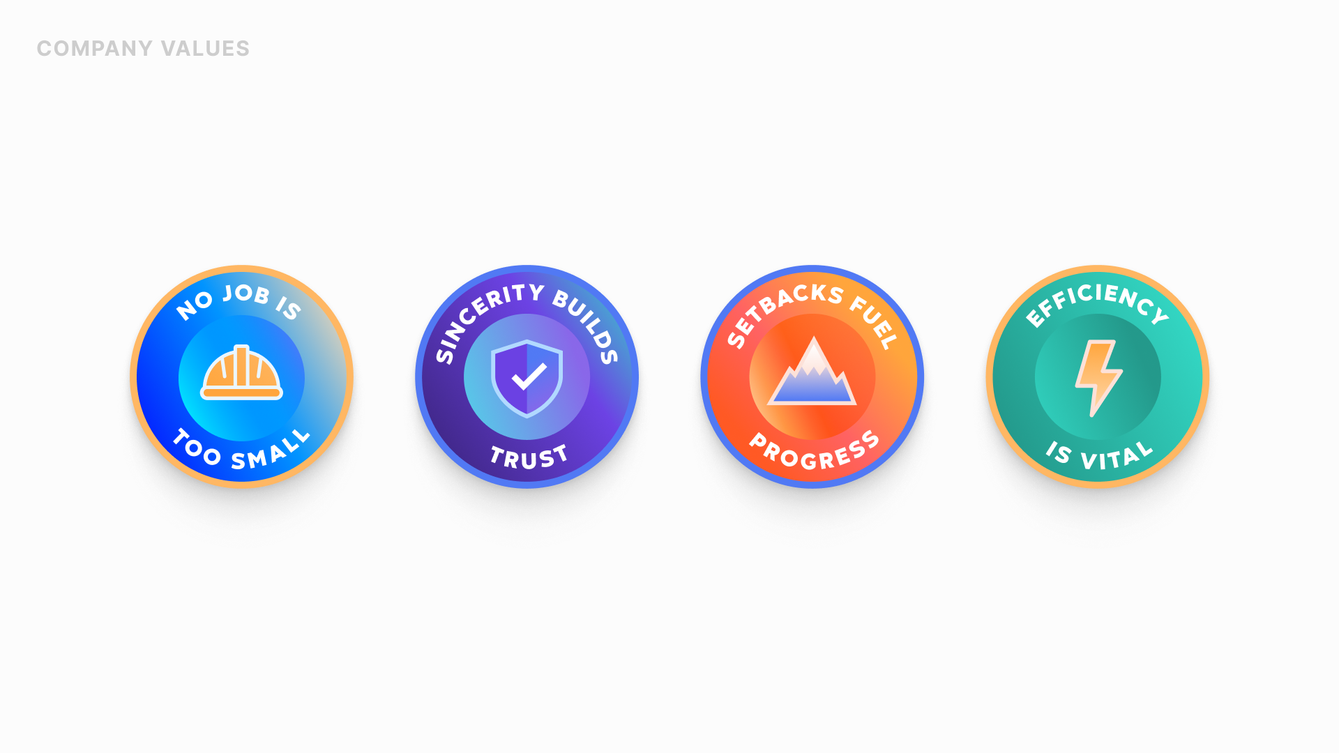
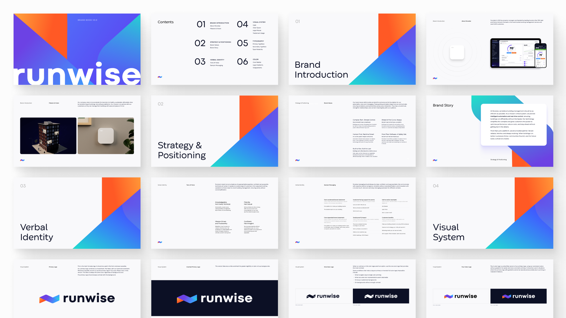
I rebuilt the brand as modular infrastructure designed to scale across product, print, and motion.
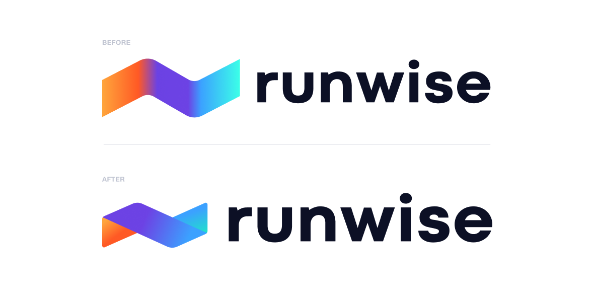
The logo was re-architected as a geometric system aligned to the product’s temperature logic: blue (below average), orange (above average), and purple (optimized), improving legibility and consistency.
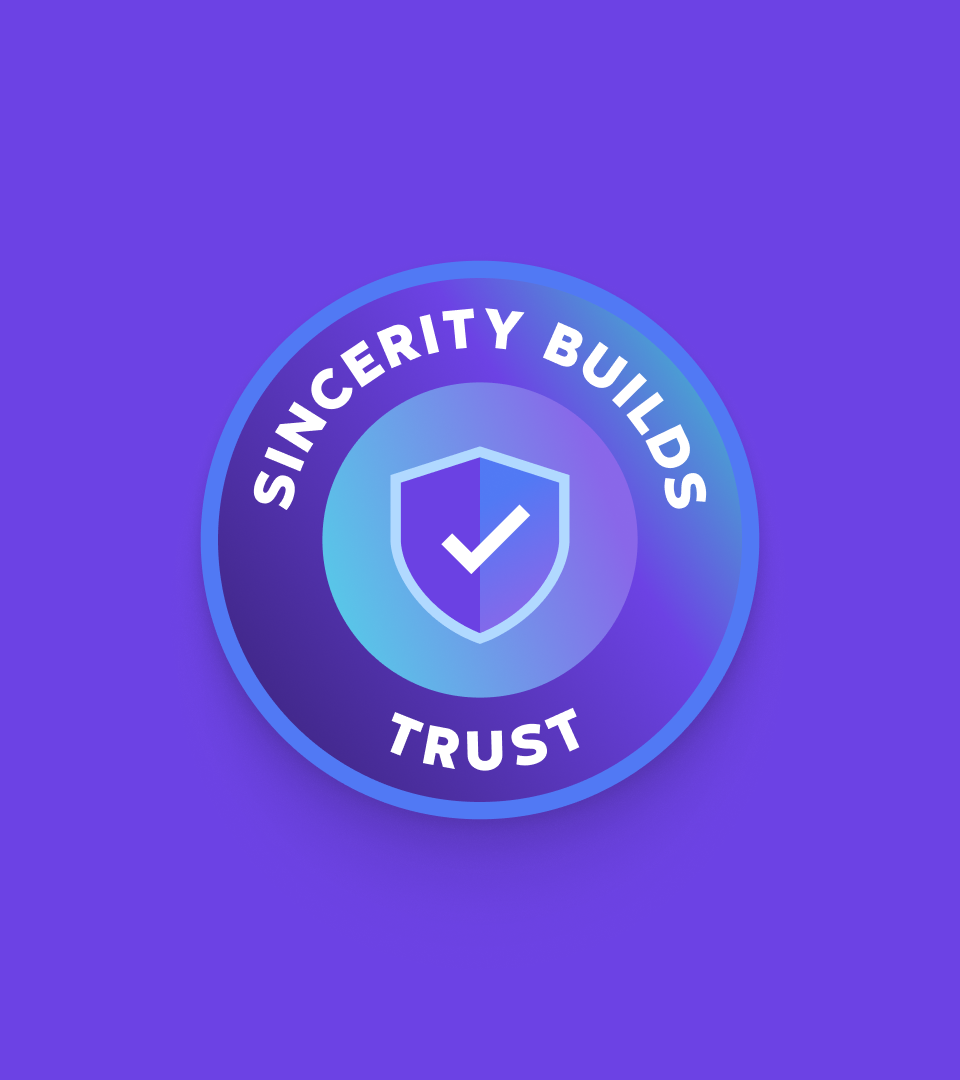
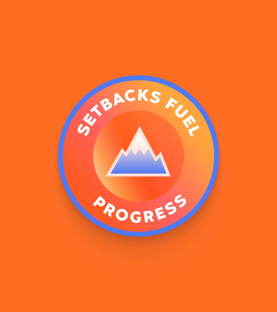
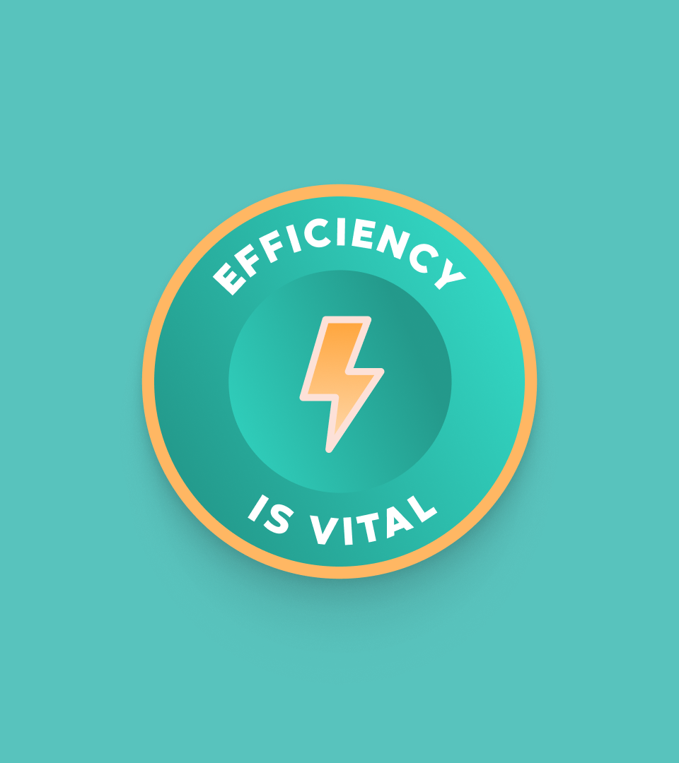
Internal research reframed Runwise as a trusted, “invisible hero.” This insight shaped the brand’s positioning, voice, messaging architecture, and visual direction.
The Impact
A brand built to scale
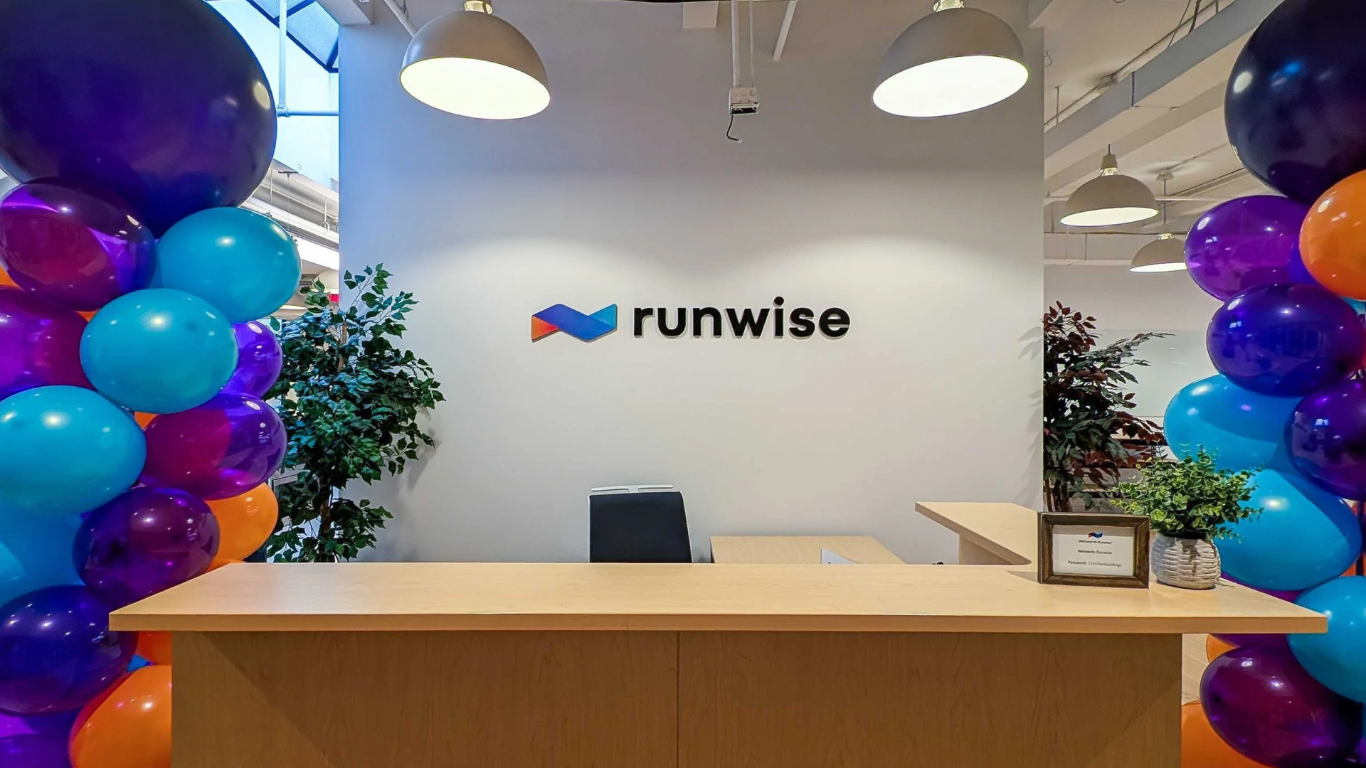
The new system gave Runwise the confidence to design consistently across every touchpoint.
Since launch, the brand now supports:
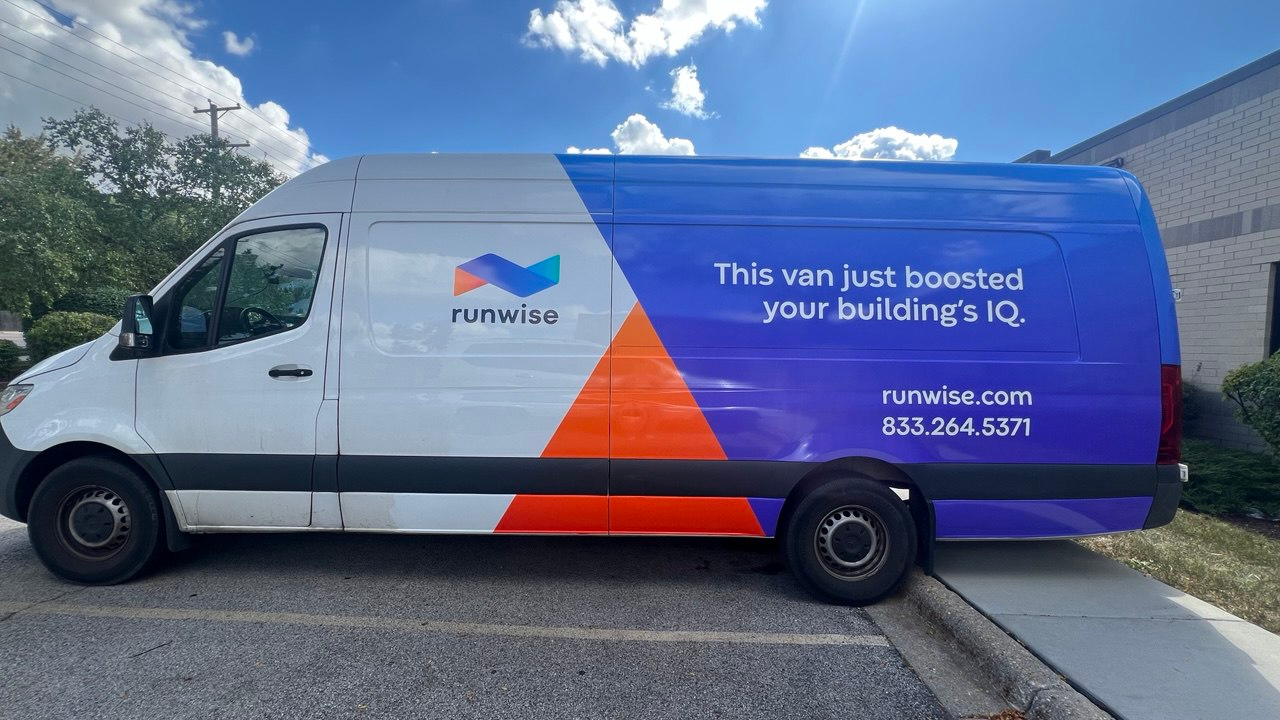
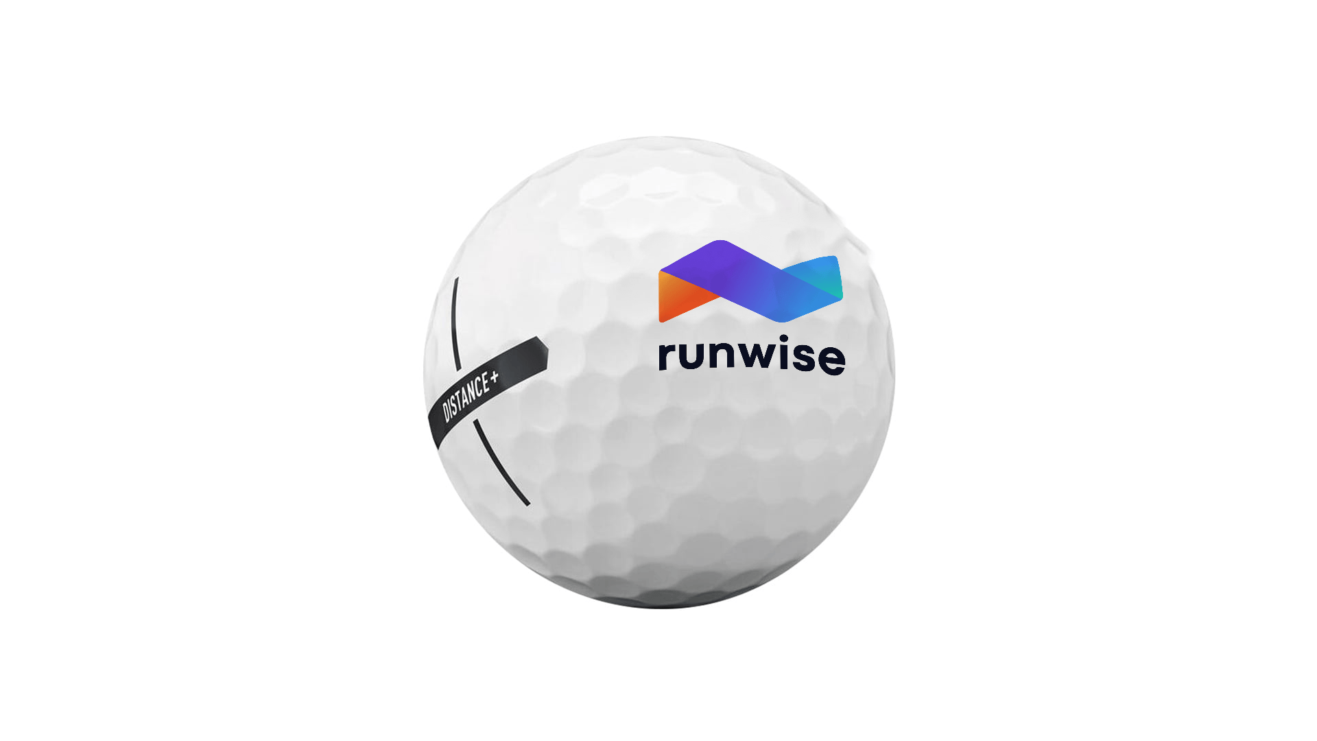
A growing library of physical assets and merchandise
A cohesive event presence across booths and installations
A visual language that scales from small objects to large environments