
Datadog Documentation
Datadog’s documentation supports engineers and operators globally, helping them install agents, integrate services, troubleshoot, and extend the platform through guides, best practices, and API references. I partnered closely with the product design team to analyze pain points and define a clearer, more usable experience. The result is a documentation experience that is more intuitive, scalable, and aligned with the Datadog brand.
Role
Product Designer
Contribution
User experience, Information architecture, Documentation systems design, Interaction design, Visual design, Cross-functional collaboration
The Challenge
From fragmented documentation to developer-first navigation
As Datadog expanded, the documentation grew dense and inconsistent. Engineers struggled to quickly find API references, setup guidance, or debugging information. Content scaled faster than the system supporting it, leaving unclear paths to answers.
The goal was to create a documentation experience that felt as cohesive, searchable, and reliable as the product itself.
The Strategy
Designing for clarity, search efficiency, and control
The redesign centered on scalable information architecture and search-first navigation.
Content was reorganized around developer intent rather than product modules, aligning categories like Getting Started, API Reference, and Guides with real workflows. Search was treated as the primary interaction surface, surfacing contextual previews so engineers could identify the right content before clicking.
The strategy reduced cognitive load, improved findability, and gave developers faster, more confident paths to answers.
The Solution
A developer-centric documentation system
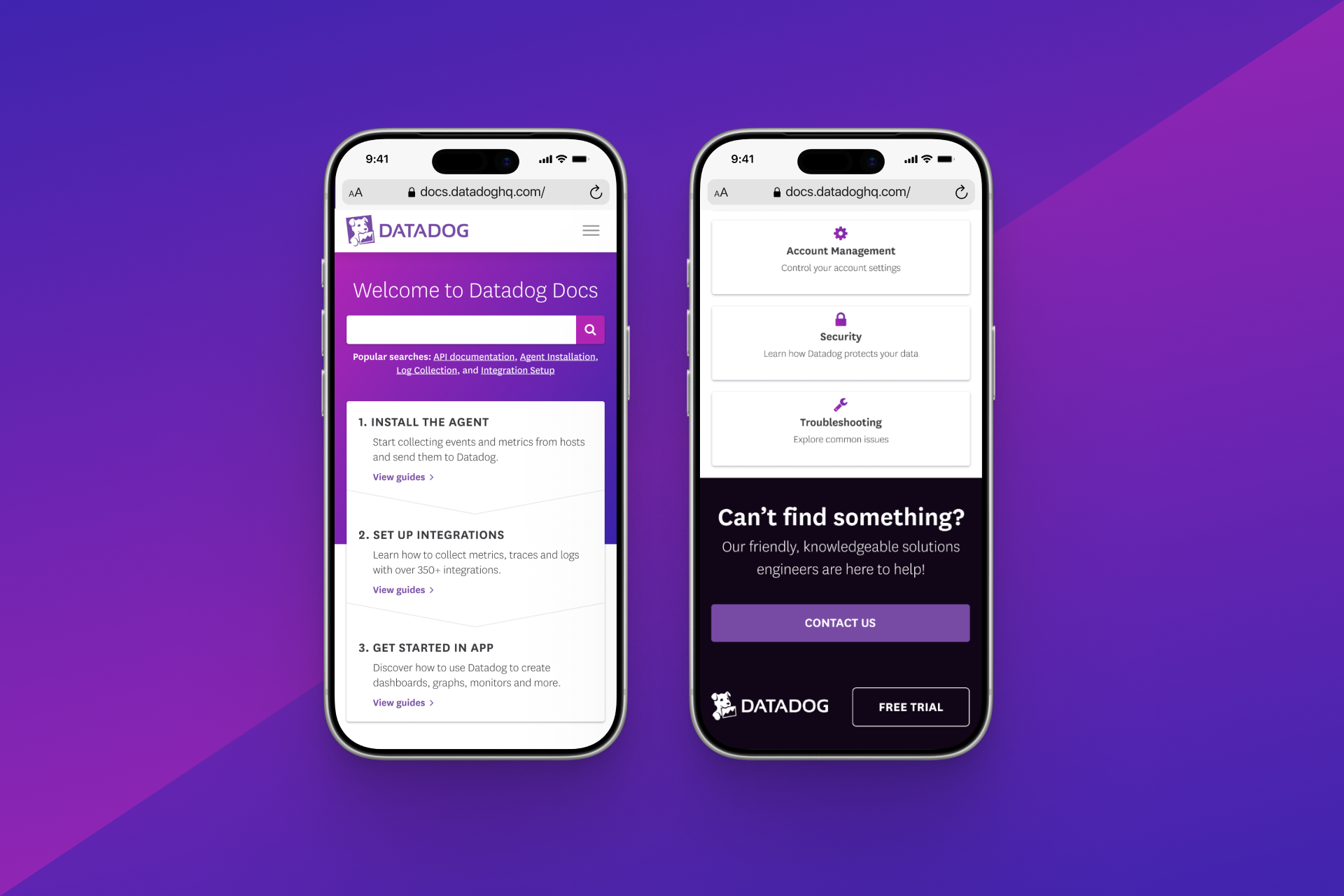
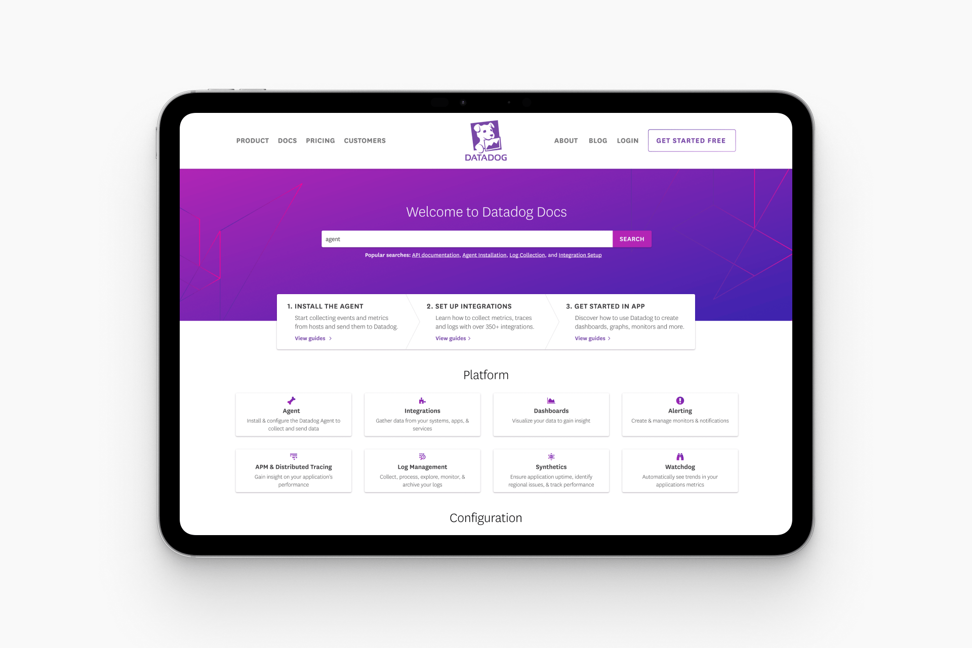
The documentation hub was redesigned for clarity, scale, and ease of use across a rapidly growing content ecosystem.
Navigation was reorganized around user intent, with scalable categories like Getting Started, Guides, API Reference, and Integrations. Search was elevated with autocomplete, keyword matching, and contextual previews to support faster discovery. Content patterns were standardized across tutorials and references to create a more predictable experience, supported by refined hierarchy, sticky navigation, and improved readability for long-form technical content.
The Impact
Turning qualitative signals into a clear product win
The redesign received strong qualitative feedback from both engineers and internal teams. Users reported faster access to API references and setup guidance, with clearer navigation and improved usability.
Internal teams saw a reduction in documentation-related complaints, indicating stronger self-serve behavior and less reliance on manual support.
Beyond immediate improvements, the work established a scalable documentation system designed to support continued product and content growth without sacrificing clarity.
Heatmap of user activity on the redesigned site